Most beginners look at a crypto chart and see noise. Red candles, green candles, wavy lines crossing each other. It looks complicated because nobody explained the basics first. Once you understand what each element shows, charts become straightforward tools rather than intimidating walls of data.
This guide covers the fundamentals you need to read a crypto chart confidently.
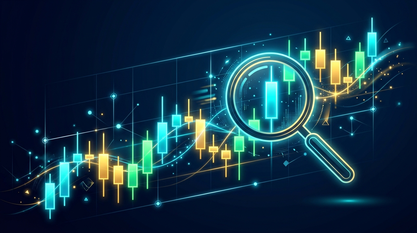
The Candlestick: What One Candle Tells You
The most common chart type in crypto is the candlestick chart. Each candle represents a time period — it could be 1 minute, 1 hour, 1 day, or 1 week depending on your settings.
Each candle shows four pieces of data for that period:
- Open — The price at the start of the period
- Close — The price at the end of the period
- High — The highest price reached during the period
- Low — The lowest price reached during the period
The wide body of the candle shows the distance between open and close. The thin lines extending above and below (called wicks or shadows) show the high and low.
A green candle means the price closed higher than it opened. A red candle means it closed lower. Some platforms use white/black instead of green/red — same logic applies.
Timeframes: What You Are Actually Looking At
The timeframe setting is one of the most important controls on a chart. A 1-day chart shows each candle as one full day of trading. A 1-hour chart shows each candle as one hour.
For short-term trading, traders often watch the 15-minute or 1-hour chart. For longer-term analysis, the 1-day or 1-week chart gives a clearer picture of overall trend direction. Most beginners should start with the daily chart — it shows the big picture without the noise of short-term price swings.
Support and Resistance: Where Price Tends to Pause
Support is a price level where buying tends to appear consistently, preventing further drops. Resistance is a price level where selling tends to emerge, preventing further rises.
You identify these by looking at where price has repeatedly bounced or stalled in the past. If Bitcoin hit $60,000 three times and reversed each time, that is resistance. If it kept bouncing off $50,000, that is support.
These levels matter because other traders watch them too. When price approaches a known support level, buyers who remember the previous bounce often step in again. This self-reinforcing behavior makes support and resistance genuinely useful.
Volume: The Crowd Behind the Move
Volume bars appear below the price chart. They show how much of an asset was traded during each period. A price move accompanied by high volume is more significant than the same move on low volume. A 5% rally on thin volume might reverse quickly. The same rally on heavy volume suggests stronger conviction.
Watch for volume spikes. They often mark important turning points or the beginning of significant moves.
The 200-Day Moving Average: One Line That Matters
Moving averages smooth out price data to show the underlying trend. The 200-day simple moving average (SMA) is one of the most watched indicators in all of finance, not just crypto.
It calculates the average closing price over the past 200 days. When the current price is above the 200 SMA, the asset is broadly in an uptrend. When below, it is in a downtrend. Many institutional investors use this single line to determine whether they are in "risk-on" or "risk-off" mode.
Add the 200 SMA to your chart in any trading platform and you will immediately see long-term trend context that individual candles cannot give you.
RSI: Spotting Overbought and Oversold Conditions
The Relative Strength Index (RSI) is a momentum indicator shown in a separate panel below the main chart. It ranges from 0 to 100.
Readings above 70 suggest the asset may be overbought — meaning it has risen quickly and might be due for a pullback. Readings below 30 suggest oversold conditions — it has fallen sharply and might be due for a bounce.
RSI is not a perfect buy/sell signal. Assets can stay overbought for extended periods during strong bull markets. But it gives context: buying an asset with RSI at 85 is higher risk than buying the same asset at RSI 35.
Where to Practice Reading Charts
TradingView is the most popular platform for crypto chart analysis. The free tier is fully functional and covers all major assets. CoinGecko and Binance both have built-in charting tools as well.
The best way to learn charts is to look at historical data. Open the daily chart for Bitcoin and look back at 2021, 2022, 2023. Identify where support and resistance held. Notice how RSI behaved at market peaks and bottoms. Track what volume looked like during major rallies versus during sideways consolidation.
Reading charts is a skill that improves with practice. Start simple, focus on trend direction, support/resistance, and volume — and add indicators only once the basics feel natural.
If you want to put your chart analysis to work with automated trading, Coinrule lets you build trading rules based on technical indicators without any coding. Affiliate link — we may earn a small commission at no extra cost to you.